| Home | Portfolio | Services | About | Blog | |||||
| 801.368.0884 |


Delicate Arch—
Arches National Park
Click here
for more info on
how to buy one!
| This Month's Graphic Design: Hawaiian Hang Tags |
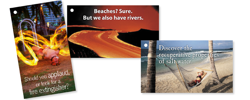
I was the graphic designer for a Hawaiian promotion campaignwith E. Excel International, called the Hawaiian SUNSation. Every year E. Excel takes their top-selling sales people on a tour to somewhere in the world. This particular year it was to Hawaii. We made several publications in conjunction with the trip—a catalog of items they could win, promotional flyers to get them revved up in anticipation, an itinerary to help them plan, and even name tags and luggage tags that were customized to each person. Among the other items were these hang tags (hence the hole in the upper left of each tag). We placed these on some of the promotional items that we sent out to the distributors who were making the most progress toward their Hawaiian trip. |
Now, I’ve always believed that the best designs are accompanied by even better copywriting. Sure, a picture may speak a thousand words, but a picture with a clever line of text or a good caption can speak a hundred thousand words. So in laying out these tags I had to come up not only with some relevant images that said “Hawaii”, but also come up with some clever lines of copy. Chosing the images was a challenge because even though I found lots of great images, I needed to remember that I had to come up with a catchy tag line to go along with each one. But regardless, I usually start this process by looking at others’ work—in other words, getting inspiration. |
Once I get in to the swing of things, ideas usually come pretty rapidly and I write them all down. Then I let them stew overnight, and come back to them the next morning and see if I still feel the same way about what I’ve designed and written. I show comps, or proofs, to others to get their feedback on which ones work and which don’t, and make adjustments and changes with the design or the copywriting. In the end this project was a lot of fun and accomplished its goal of helping the sales team have an enjoyable trip. |